2021 | Branding | Identy Visual
Lord Bolton
[EN]
__
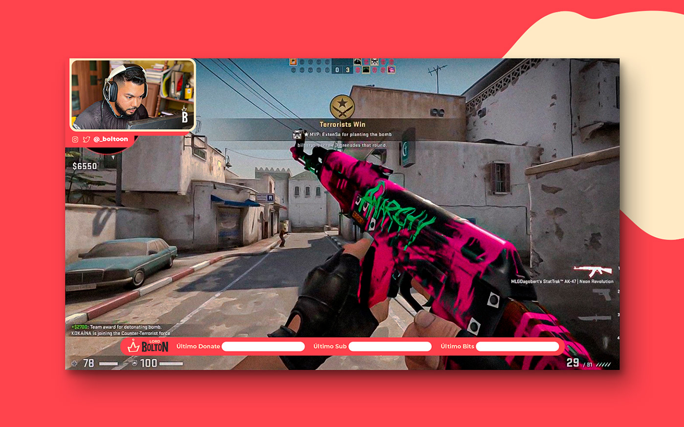
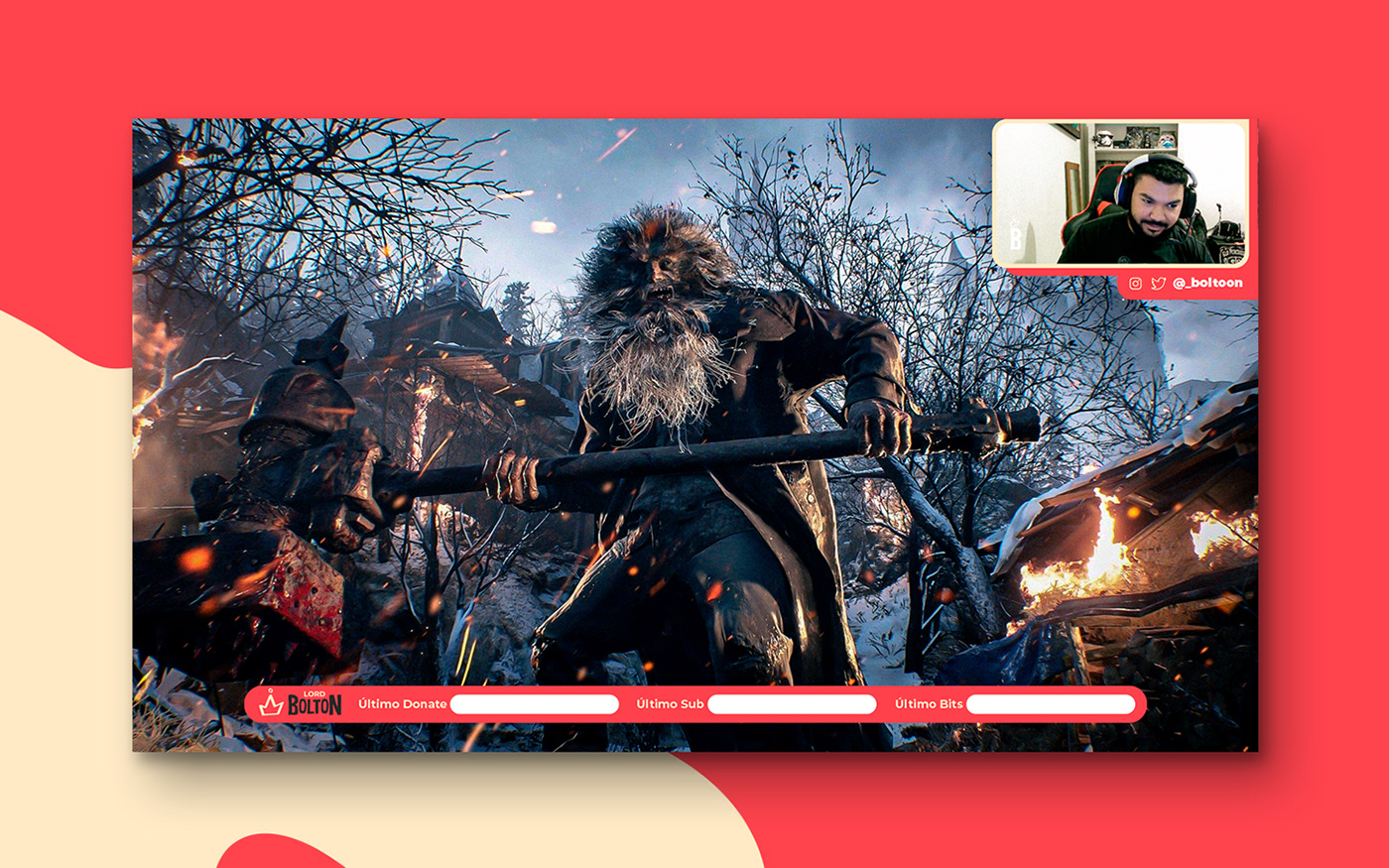
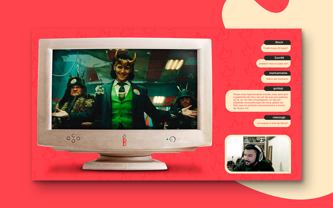
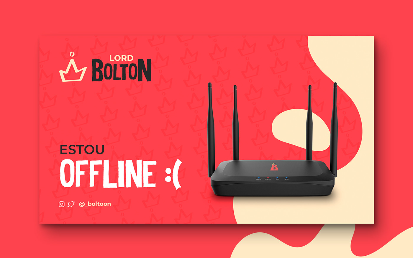
Lord Bolton is a stream channel that focuses on gameplay in general but tends to have more emphasis on FPS games like Counter-Strike: Global Offensive, Call of Duty: Warzone, Valorant and so on.
Its name derives from one of the houses of the tv series Game of Thrones, in which this project has as its main visual inspiration.
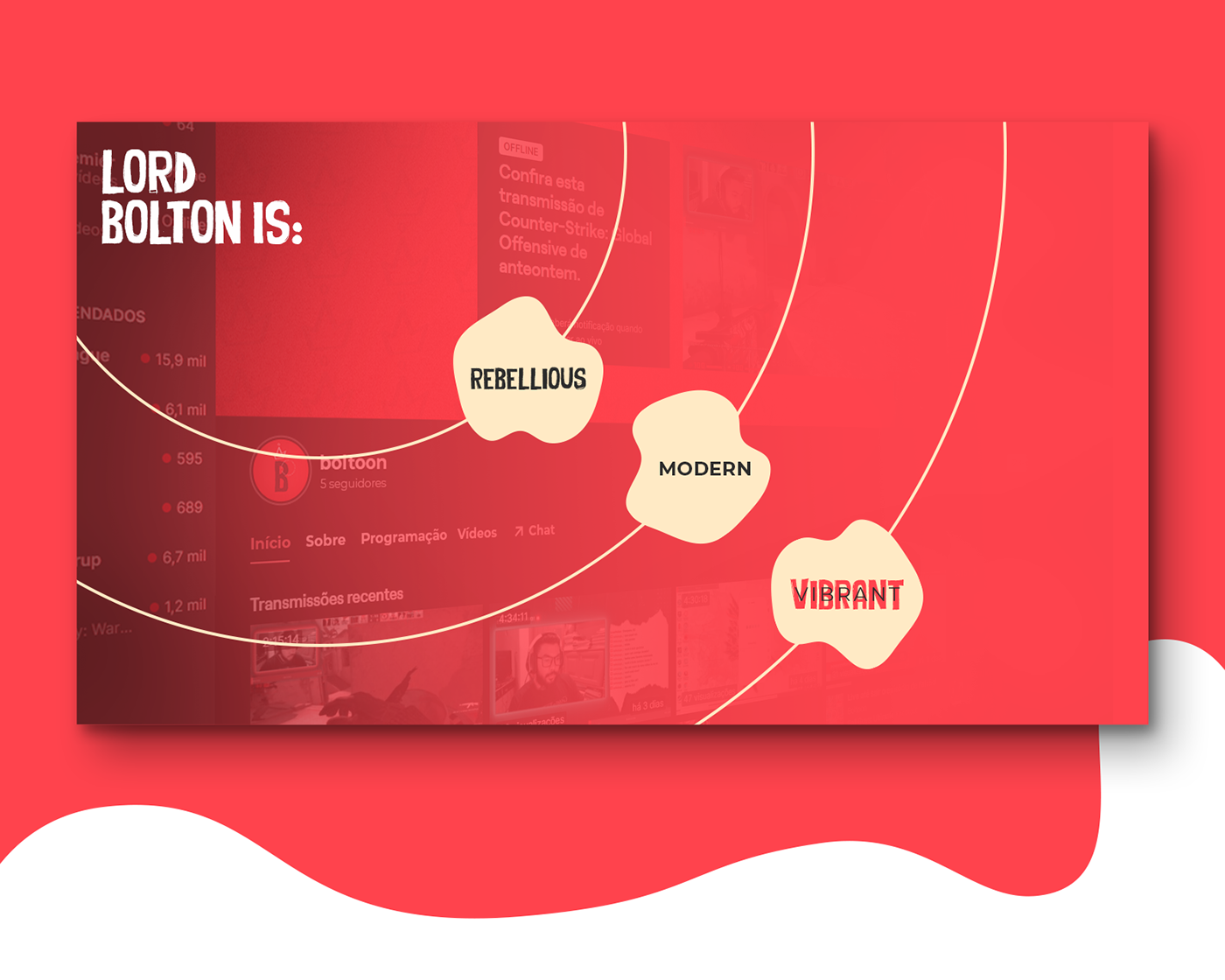
The project's objective was to create a visual identity in which it could connect with its audience, creating empathy and a better engagement. The biggest challenge of this project was to create elements that visually convey the essence of the brand, bringing aspects of the Middle Ages in a modern way.
[PT-BR]
__
Lord Bolton é um canal de stream que tem como foco, gameplays em geral mas, tende a ter maior ênfase em jogos de FPS como: Counter-Strike: Global Offensive, Call of Duty: Warzone,Valorant e etc.
Seu nome deriva de uma das casas da série televisiva Game of Thrones, na qual esse projeto tem como principal inspiração visual.
O objetivo do projeto foi criar uma identidade visual na qual, conseguisse se conectar com o seu público, criando empatia e um maior engajamento. O maior desafio deste projeto foi, criar elementos que transmitissem visualmente a essência da marca, trazendo aspectos da idade média de forma moderna.

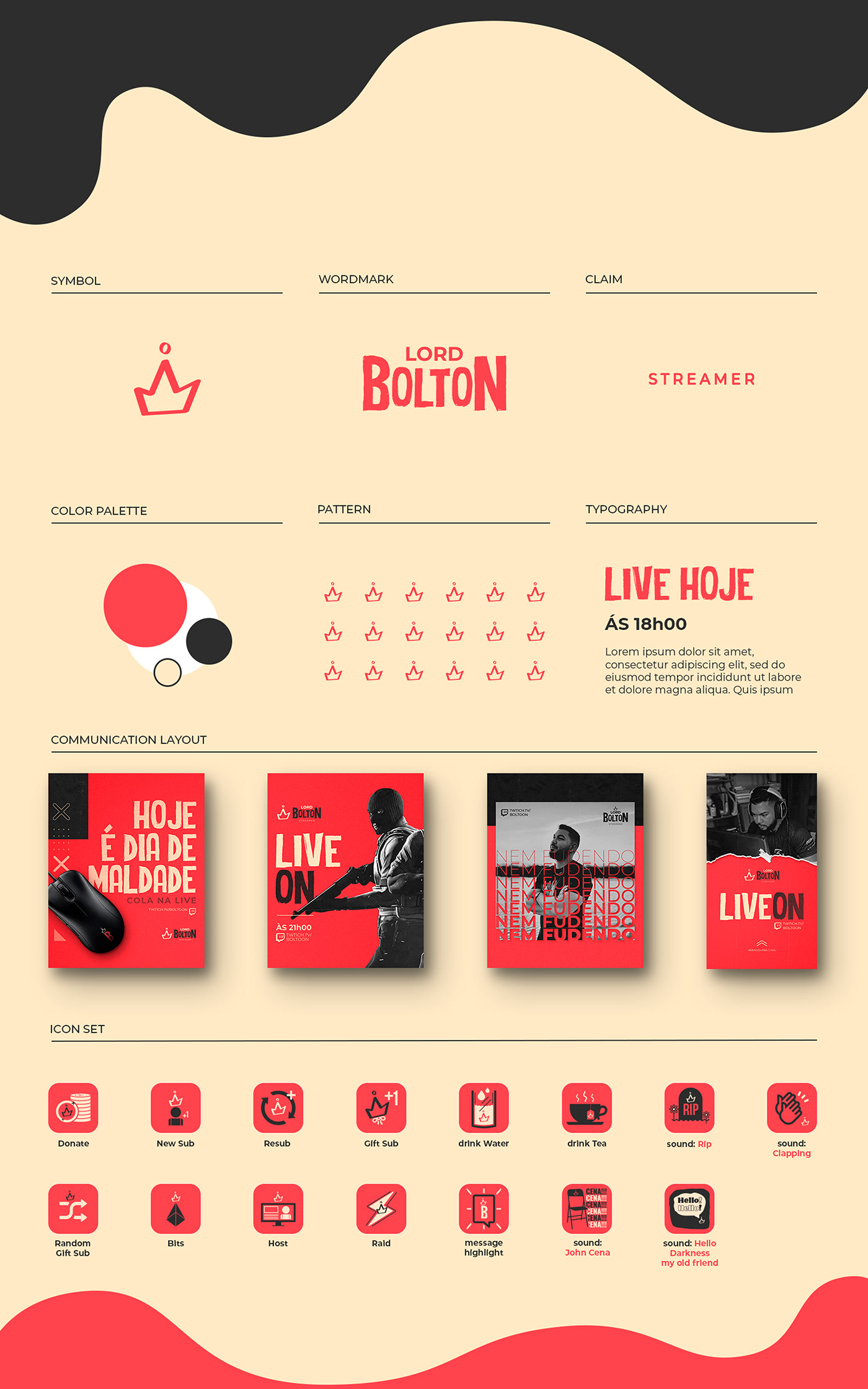
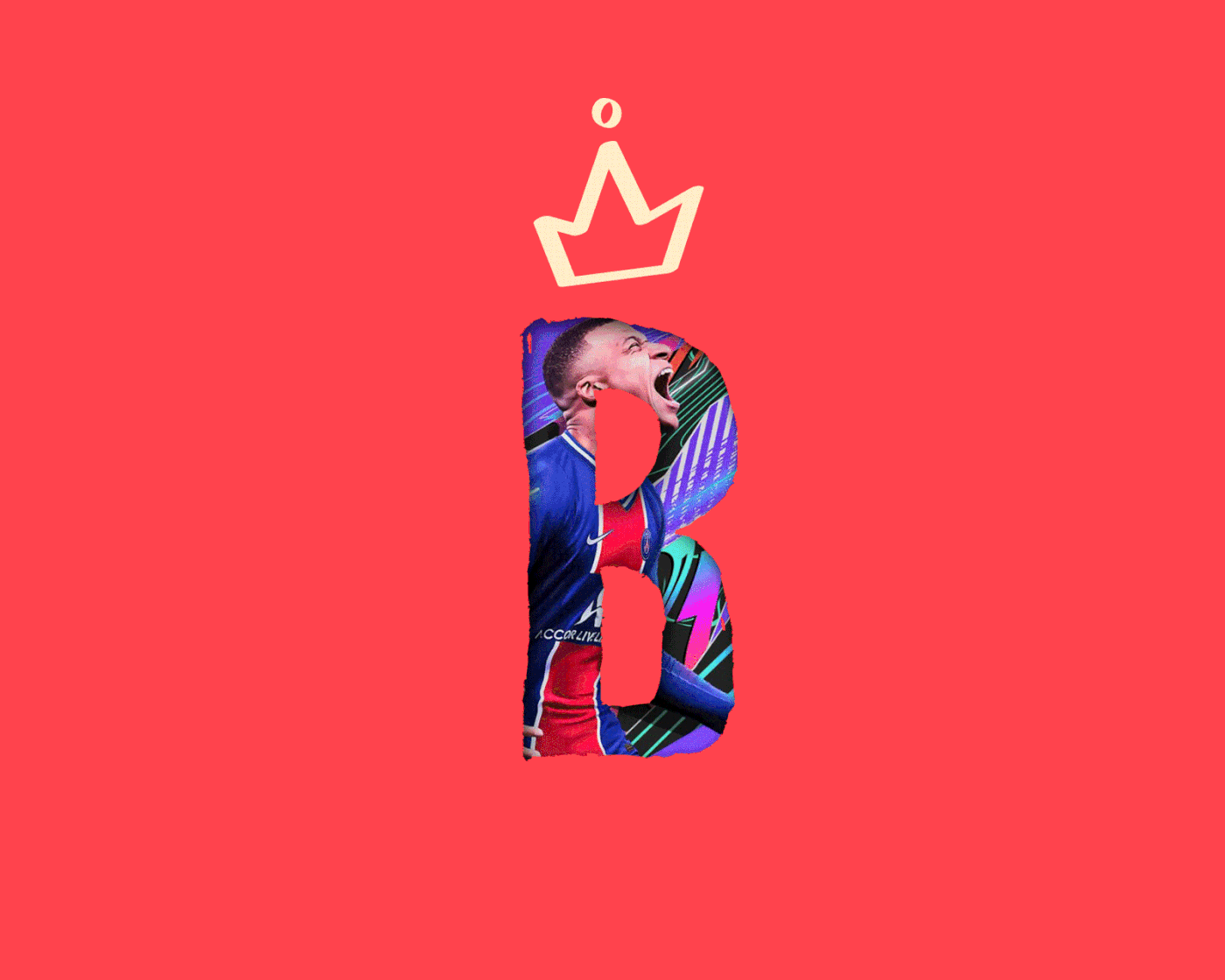
Symbol
[EN]
__
Modern and Rebellious is how the symbol is described.
The crown was the symbol chosen for the brand, it represents the Medieval Era (the time when the television series was inspired), as it means the monarchy, which was the system adopted in the Middle Ages.
Its simple and minimalist shape, asymmetrical construction and contrasting lines makes the symbol look modern and rebellious, everything the brand wants to convey.
[PT-BR]
__
Moderno e Rebelde, é como o símbolo é descrito.
A coroa foi o símbolo escolhido para a marca, ela representa a Era Medieval (época em que a serie de televisão tem como inspiração), pois ela significa a monarquia, que era o sistema adotado na época da Idade Média.
Sua forma simples e minimalista, construção assimétrica e contraste nas linhas fazem com que, o símbolo tenha um aspecto moderno e rebelde, tudo que a marca quer transmitir.


Typography
[EN]
__
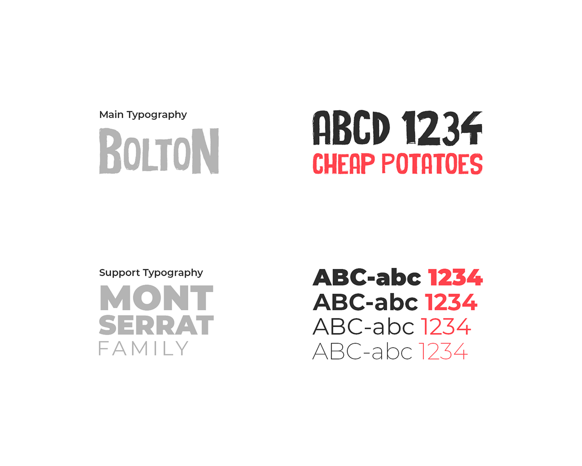
The chosen typographies also come from the same source as the symbol, the main typography has irregular lines that carry a strong and rebellious aspect, while the supporting typography was chosen because it is modern, simple and very versatile.
PT-BR]
__
As tipografias escolhidas também bebem da mesma fonte do símbolo, a tipografia principal tem traços irregulares que carrega um aspecto forte e rebelde, já a tipografia de apoio, foi escolhida por ser moderna, simples e muito versátil.
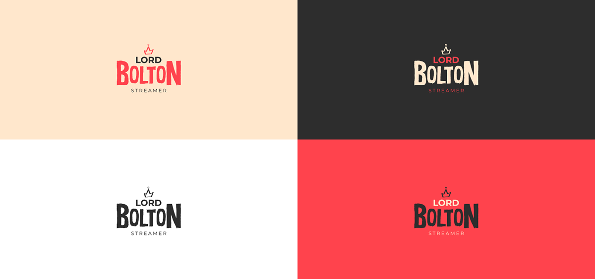
Collor Palette
[EN]
__
For the construction of the color palette, the colors of the Casa Bolton flag were used as inspiration.
Its base colors are Black, Red and Yellow.
[PT-BR]
__
Para a construção da paleta de cores, foi usado como inspiração as cores da bandeira da Casa Bolton.
Suas cores base são o Preto, Vermelho e amarelo.

[EN]
__
The original palette's nuances and tones were changed to better suit the project, so the Black, which was predominant in the original color palette, was replaced by Red to emphasize the rebellious and vibrant personality of the brand.
[PT-BR]
__
Foi mudado nuances e tons da paleta original para se adequar melhor com o projeto, sendo assim, o Preto que era predominante na paleta de cores original, foi substituído pelo Vermelho para dar maior ênfase na personalidade rebelde e vibrante da marca.


main signature

vertical signature
alternative signature